
by Kirsten McGoey | Dec 31, 2022 | Ajax, Ajax headshot photographer, Ajax headshot photographer, Bowmanville, Bowmanville headshot photographer, Brooklin headshot photographer, Business Content, Corporate, Courtice headshot photographer, Durham Region, Headshot, Lead Generation, Local Business, Modern, Orono headshot photographer, Oshawa headshot photographer, photographer, Photography, Pickering headshot photographer, Pickering headshot photographer, Port Perry, Portraits, Scarborough, Storytelling, The Corporate Group Experience, Trinity Design, Uxbridge, Uxbridge headshot photographer, Whitby, Whitby headshot photographer
Team photos in studio complete the look opf individual teams.
This past November we worked with Sean Aune and his team to update their individual and team headshots. They had recently done images that they felt did not represent their team and wanted a modern, fresh look in keeping with the IG Wealth Management brand.
We picked a solid navy background which already modernized the look. Then with some coaching we helped the team pick their outfits and with posing in the studio. Posing sometimes can come naturally but we are there to make you at ease, shoot a few images tethered to show you the way you are smiling, holding your head and the impact of a few changes to your posture.
When blogging a session we love to show you how the image is being used by the client. Each team member now has this on the website making them look cohesive, professional and current.
Below you can see the various team members 5×5 crops which we provide alongside each full sized image – ready to be popped into social media – Linked In, your website, Facebook and Zoom feeds. The world may be back to some of the pre 2020 habits but we are still making first contact online most of the time and the right look can mean the difference between a lead passing you by and engaging.
The team is hoping to expand the content in 2023 with some in office images and we cannot wait to see them all again.
Need content for your social media and websites for your team?
Connect with us: https://trinitydesign.ca/connect-2/
Kirsten McGoey | Visual Storyteller | Trinity Design Photography
by Kirsten McGoey | Dec 27, 2022 | Ajax headshot photographer, Bowmanville headshot photographer, Brooklin, Brooklin headshot photographer, Business Content, Corporate, Courtice headshot photographer, Durham Region, Headshot, Local Business, Markham, Orono headshot photographer, Oshawa, Oshawa headshot photographer, photographer, Photography, Pickering headshot photographer, Pickering headshot photographer, Scarborough, Storytelling, The Corporate Group Experience, Trinity Design, Uxbridge headshot photographer, Whitby, Whitby headshot photographer
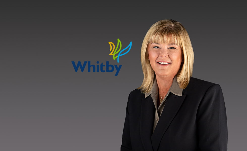
In November we were tasked with updating the portraits for the newly elected Town Council for the Town of Whitby.
Over the past ten years we have worked with organizations to create images that support their overall brand strategy. What is a brand? It is not something tangible – you cannot reach out and touch it – but it forms for an organization a dialogue between it and the people it serves. It is made of logos, missions and its voice – alongside the visuals such as graphics, illustrations and photography.
Our new town brand “features a unique, modern logo, created by a single flowing line that forms a subtle handwritten “W” for “Whitby.” The line graphic begins as a gold upward curve, giving a nod to Whitby’s heritage. The line turns to green to represent the community’s growth, and active and green spaces, before finishing in cyan (a bright blue) to represent the Town’s waterfront and friendly nature. The palette also includes the navy from the Town’s previous brand representing stability. Collectively, the colours signal a community that is welcoming, growing and transforming.”
Each headshot for our councillors knits together each individual ward and regional councillor with a recognizable look and feel. We moved away from department store and school photo textured backgrounds which read as outdated and instead used a modern, solid colour background.
The new website images are a full page width and feature a gradient background – the Savage solid colour papers create a modern look. A gradient overlay ties in the overall look so it remains consistent between staff members.
We are looking forward to the new planning and strategies to come under Mayor Elizabeth Roy and council. We wish them all the best in their new terms and enjoyed the creation of images that align with this refreshed council team.
Kirsten McGoey | Visual Storyteller


-SQ")


Recent Comments