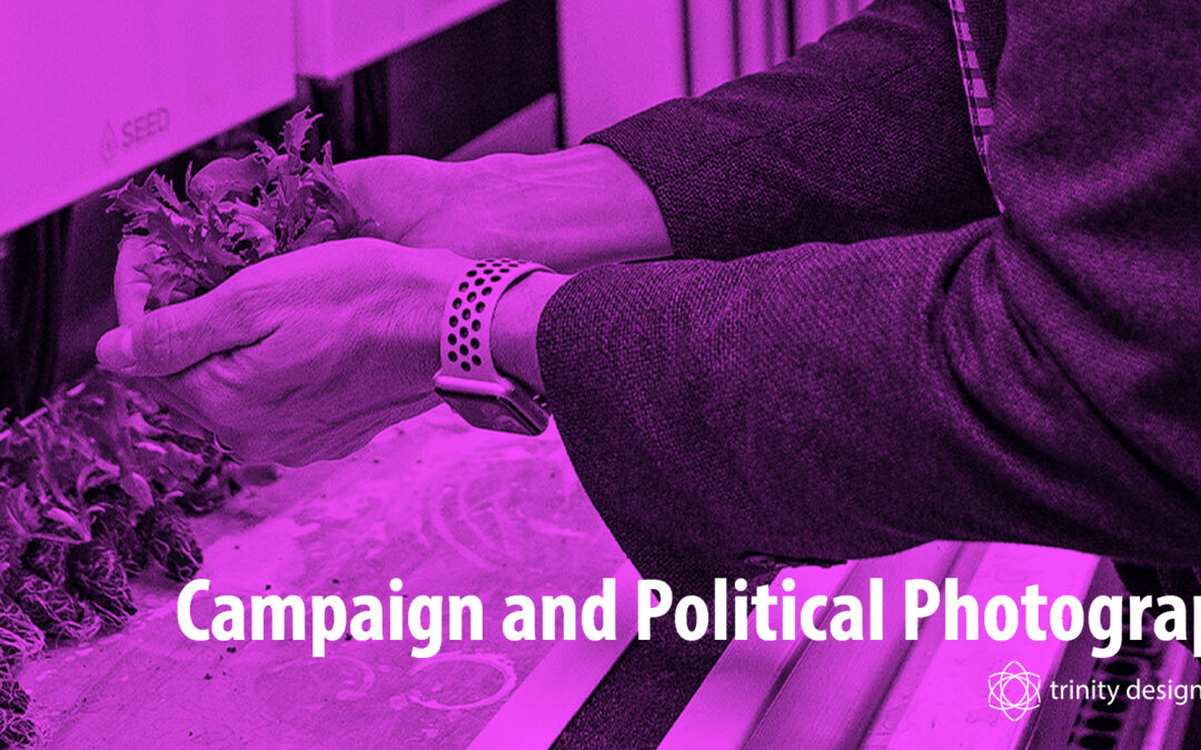
Campaign Photography: Durham Region, Ontario
Trinity Design Photography provides strong political storytelling photography for candidates running for office in the Durham Region. Our thirteen years of experience combined with an understanding of the rules stated by Elections Ontario provides clients with a base for starting their political campaign. That being said we always recommend referring to the Candidates Guide (F 0405) for the most current information as this article ages.
NOTE: Images shown are from clients and showcase our work in this field or captured at events where political figures are present, asking local photographers to purchase event images can be a great way to flush out your social media campaign where applicable.

Read your Candidates Guide (F0405) from cover to cover.
This will give you the full understanding of the rules around the content you are creating, timelines for creating it and blackout periods where it cannot be used in your campaign.
Images created must be done using your own funds.
Images made for example, while sitting as a councillor for a municipality cannot be used for campaigning again for that same role. Same goes for that employer funded headshot from any job you hold outside the political arena.
The CFO of your campaign finances pays for all images created for your campaign.
“The CFO administers budgets and authorizes all payments, keeps records of all the financial transactions and issues tax credit receipts to contributors.” (EO – Candidates Guide)
Restrictions on Commercial Advertising.
“It is important for candidates to note that there are restrictions on paid political advertising on specific days in the campaign period. This is called a blackout period. The blackout period includes the day before election day and election day for all elections.” (EO – Candidates Guide)
What is political advertising?
“Social media posts by an individual are generally not considered political advertising. However, if the placement of the posts involves any production or distribution costs, the posts may be considered political advertising.
Political advertising on social media
Paid commercial advertising appearing on social media platforms and social media posts where a fee has been paid for production, distribution or promotion may be considered political advertising.” (EO – Website)


Creating images can feel a little daunting so here is what we recommend for your run for office based on the experience we have gained at the municipal, provincial and federal levels. We have created images for all three levels so this is problem solving we have worked on with dozens of candidates.
The Headshot
When creating your headshot we recommend you create a few varied images to ensure your marketing team has images for your sign, your website and your mailers.
Keep these simple on a white background so it’s easy to clip and place you on the right content.
Use them consistently across your content for face/campaign recognition.
Studio images with lighting are preferred as they are typically better detail and can be enlarged to suit a variety of campaign materials.
KEY INSIGHT: Make sure it’s a current photo, not one from ten years ago – constituents will notice (even if it was from a previous campaign).
Do NOT use Ai.
In a world with generative AI it will be tempting to generate images and I cannot stress enough DO NOT USE Ai.
While some people may be completely fine with Ai imagery there is I would argue a LARGER group of the population who finds it disingenuous, bad for the environment and generated on existing creative work.
Do not risk alienating your voters with Ai generative content and create a stand out campaign featuring an authentic series of images that showcase YOU.
What To Wear
Depending on what level of government you are running for what you wear is essential.
While we consider clothing “the frame” in headshots it is also important to consider that colour can also link you to political parties – so during a municipal campaign where parties are not in the mix it is still important to wear something that flatters your complexion and doesn’t cast colour on your skin.
During provincial and federal campaigns it is important to consider the outfits in relation to the party colours your images are appearing in. As new parties are created even the tone of the colour can matter so do your research.
What story do you want to tell?
While headshots are considered the bare minimum for a campaign I would also recommend a photography package that includes images of the candidate engaging in the community.
Highlight the work you already do – meeting people at doors, working at local events that support your community and organizations that you believe in. Are you a runner? Show yourself running. Do you like to paint? We can also capture your personal hobbies.
In the age of social media this ads to the “story” you are telling prospective voters. Align that with the videos you are showcasing on social media to build a well-rounded visual campaign.


With all that information buzzing inside your head we would love you to reach out if you plan to run in the Durham Region. We can help cut through the noise and align your photography with your campaign goals and budgets.

Kirsten McGoey
Visual Storyteller
Trinity Design Photography has served the Durham Region for over 13 years and counting. They offer a variety of retail and commercial photography services for your family and your business.


Recent Comments